"Is this Option Cheap or Expensive?"
Understanding this basic question will help you make better decisions when it comes to your options trading.
Take a look at this example:
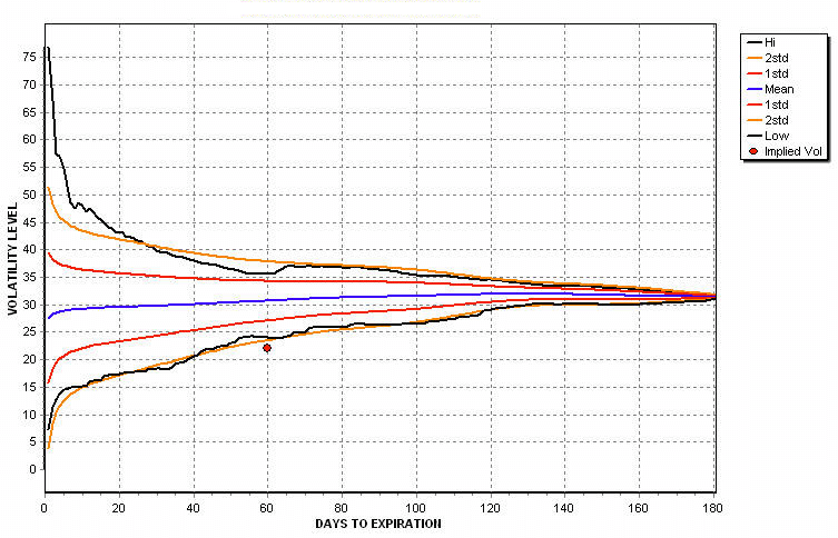
The red dot in the screen here is a plot of the implied volatility of an option. The curved lines are the actual volatility paths traded by the underlying stock for the last 6 months, broken down into its high, low and statistical bands.
The option's implied volatility suggests that the market price for this option is trading at a level well below the historical levels of the stock.
Now, would you buy or sell this option?
Maybe neither — knowing this information could not only provide good trading opportunities but it could also help prevent you from doing a BAD trade.
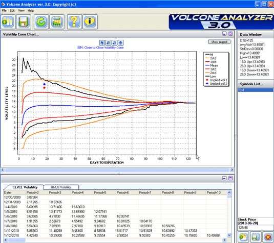
The screen shot above was taken from a product called the VolCone Analyzer.
VolCone Analyzer downloads historical price data for an instrument and performs volatility analysis over the entire price series to calculate the true, historical volatility bands experienced by the asset over the period analyzed.
Then, it will calculate what the implied volatility is for the option you choose and show you at a glance where the current value fits with the underlying price behavior. Then you can see in an instant if the option is over priced or under priced.
Watch this Video
Here's a short video review by Steve from Options University:
Summary of Features
- Zero Data Costs — VolCone makes use of freely available data via the internet so you won't have to pay a monthly data subscription.
- Unlimited number of saved models. Build your own favourites list for easy reference of daily scans.
- Easy GUI. Setting up new models is a simple 7 step procedure with the easy to use graphical interface.
- Includes streaming video tutorials. Learn how to best use the software with pre-recorded video tutorials.
- Save your charts and data for further review.
- Export results to CSV file for importing into Excel.
- Highlights whether an option is cheap or expensive given the option's implied volatility compared to the cone analysis of the historical data.
- Customization of the graph window.
- Support for non-US based markets. Because the software works with open, free data, it will also work for almost all international markets e.g. ASX, DAX, SGX, FTSE and more.
- Supports stocks, indices and ETFs.
Get access to the VolCone Analyzer
The vendor is keeping license sales restricted. Get in touch and I'll contact the vendor on your behalf — usually a quick turnaround.
Contact me to find out more →
0 Comments
No comments yet — be the first!
Add a Comment